
There were some good charts that I discovered in the Tweet on X.com about the 30-year TIPS rate reaching 2.9%:
These charts are related to dividend per share as an aggregate for the S&P 500.
The first chart shows the market implied real dividend growth rate of the index:

I wonder how does one derived a market-implied growth rate. I suppose one way is to start with an equity risk premium or a required rate of return and work that out.
In any case we can see the dividend growth rate gyrates between 1% to 7%. What is the average? Looks to be closer to 4% over the past 30 years.
That might be some numbers you wish to use if you are doing some planning.
But another take away is how these growth rates change over time. When I started investing in the 2000 to 2010, the US dividend growth rate was much higher. That fell to 1-2% range in the 2010 to 2020.
Dividend payout is a matter of tax policies and incentives.
I believe this is going to be pretty similar if you use another country context.
If you are a dividend investor, the take away might be that growth rate will be different.
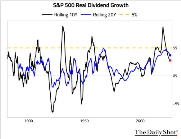
The next chart plots the real dividend growth in 10-year rolling and 20-year rolling returns:

This one should come from professor Robert Shiller’s data, which has fixed income and equity data dating back to 1871.
So what you are seeing is about 155 years of dividend data.
Enough to form nice rolling dividend growth. Each point on those charts is a 10-year or 20-year period.
There are some takeaways:
- Long term dividend growth is between a positive 5% and negative 3%
- It means you can have 10-years and 20-year of negative real dividend growth. Note that these are real growth which means that you can see positive nominal growth but its negative after factoring inflation.
- I think dividends in the US is higher in the past, but we see more variation in dividend growth as well.
The last chart is from Ned Davis Research:

This chart shows the percentage of stock that yielded more than the 10-year bond yield. I like this chart in that it allows us to see equity yield versus fixed income over time. Actually now its not too different from before 2006.
Fixed income yields used to be much higher than during the period where we have zero-interest rate policy.
So now not many firms yield more than Treasury. It is also that companies are also less focus on dividends as a policy.
Major takeaways
If you are a dividend investor, or a person planning to have dividend income in retirement, the data will show you that there are more variability in dividend growth:
- What is a good dividend growth rate to use, if you wish to use it?
- Even if you use it, acknowledge that growth can be rather varied.
- Also acknowledge that dividend growth after inflation may be zero (and that may be okay. Perhaps a lesson for another day)
Whichever way, every time I get a comment of how uncertain the SWR is… KNN its because people cannot see dividend stocks are just like any stocks in a portfolio of stocks (that may be implemented with a SWR). They are just going to have varied valuation, growth rates.

Kyith is the Owner and Sole Writer behind Investment Moats. Readers tune in to Investment Moats to learn and build stronger, firmer wealth foundations, how to have a Passive investment strategy, know more about investing in REITs and the nuts and bolts of Active Investing.
Readers also follow Kyith to learn how to plan well for Financial Security and Financial Independence.
Kyith worked as an IT operations engineer from 2004 to 2019. Currently, he works as a Senior Solutions Specialist in Fee-only Wealth Advisory Firm Providend. All opinions on Investment Moats are his own and does not represent the views of Providend.
You can view Kyith’s current portfolio here, which uses his Free Google Stock Portfolio Tracker.
His investment broker of choice is Interactive Brokers, which allows him to invest in securities from different exchanges all over the world, at very low commission rates, without custodian fees, near spot currency rates.
You can read more about Kyith here.